Primary vs Secondary Conversions: A Simple Framework for Choosing What to Track

Intro
Most websites don’t have a tracking problem. They have a decision problem.
When you track every click, scroll, and page view as if it’s “success,” your dashboard becomes a junk drawer. Stuff is in there… but you can’t use it to make better calls.
What counts as a conversion
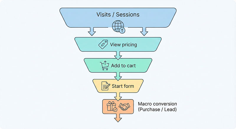
A conversion is an action you can measure that represents real progress toward value. Not “someone looked at something.” Not “someone hovered.” Progress.
Here’s a practical way to think about it:
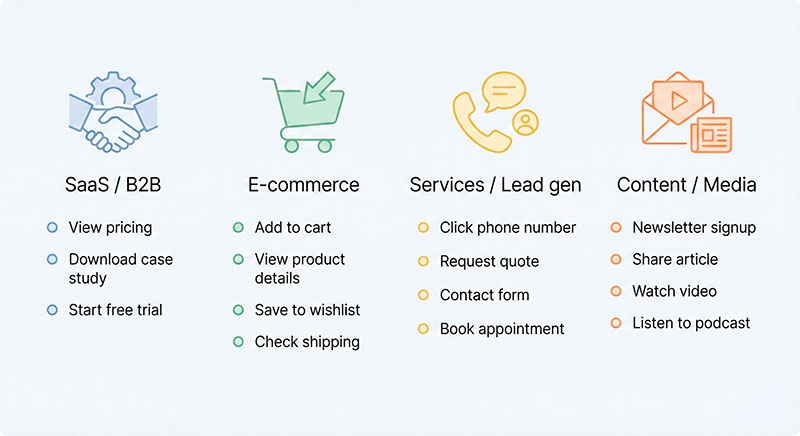
- E-commerce: completing checkout, starting checkout, adding shipping info
- SaaS: starting a trial, reaching “activated” (first meaningful use), upgrading
- Lead gen: submitting a qualified form, booking a call, requesting a quote
- Content / membership: signing up for a newsletter, starting a free membership, upgrading to paid
A useful rule of thumb: If it doesn’t change a decision, don’t call it a conversion.
Some teams like to group outcomes as macro conversions (the “money moment”) and micro conversions (small steps that suggest intent). That’s fine—as long as everyone agrees what’s in each bucket.
The two-tier model: one outcome to optimize, several signals to learn from
Think of your measurement as two tiers:
- Tier 1 (Outcome): the action that best represents success for the business.
- Tier 2 (Signals): actions that help you understand intent, diagnose drop-offs, and spot friction early.
In many teams, Tier 1 is what they call primary conversions, and Tier 2 are secondary conversion actions—but the idea works anywhere, even if you never touch ad platforms.
Why this separation matters:
- It prevents “busy metrics” (numbers going up while the business doesn’t).
- It makes experiments easier: you know what “winning” means.
- It keeps reporting clean: one main line, supporting context underneath.
Here’s a simple way to visualize it:
| Outcome metric | Diagnostic signals |
|---|---|
| Purchase completed | Add to cart, begin checkout, payment error shown |
| Qualified lead submitted | Form started, phone click, calendar view |
| Trial activated | Trial started, key feature used, onboarding completed |
| Membership upgrade | Newsletter signup, pricing page viewed, plan comparison clicked |
A simple framework to choose what goes in Tier 1 vs Tier 2
Use this 5-question test. Don’t overcomplicate it—score quickly, then sanity-check with common sense.
Business value
Does this action clearly connect to revenue, retention, or qualified demand?
- If it’s hard to explain the value in one sentence, it’s probably a signal, not an outcome.
Proximity
How close is it to the “money moment”?
- “Viewed pricing” is closer than “read a blog post,” but it’s still not the outcome.
Volume & timing
Do you see enough of it to learn from weekly?
- If your real outcome is rare, you may need a proxy (we’ll cover that next).
Controllability
Can your team actually influence it with product or marketing changes?
- If it’s mostly luck or external factors, it’s a weak Tier 1 candidate.
Noise & abuse resistance
Can it be triggered accidentally, duplicated, or faked?
- If spam can inflate it, it needs extra rules—or it belongs in Tier 2.
A quick scoring example (High/Medium/Low):
- Purchase completed: Value High, Proximity High, Volume Medium, Controllability Medium, Noise Low
- Newsletter signup: Value Medium, Proximity Medium, Volume High, Controllability High, Noise Medium
- “Scrolled 75%”: Value Low, Proximity Low, Volume High, Controllability Medium, Noise High
[IMAGE: 5-question scorecard with three rows of example actions]
When your main conversion is too rare: choosing the right proxies
Sometimes the “true outcome” is rare:
- You have low traffic
- Your sales cycle is weeks or months
- Your product is high-ticket B2B
In that case, you can use a proxy—an earlier action that tends to predict the outcome. The trick is choosing proxies that behave like leading indicators, not vanity activity.
A good proxy is:
- Predictive: people who do it are more likely to reach the real outcome
- Earlier: it happens before the outcome (so you can act on it)
- Meaningful: it reflects intent or qualification, not curiosity
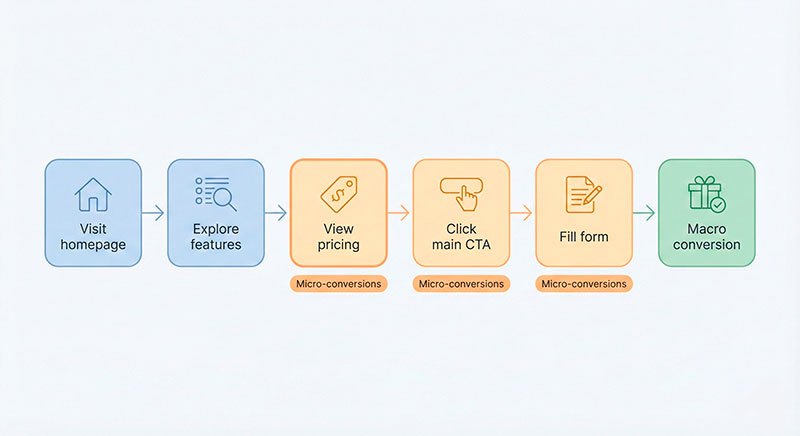
Example proxy chain for a consulting site:
- Read “pricing” → start quote form → submit qualified details → booked call → signed contract
[IMAGE: Rare outcome to proxy chain diagram with 3–5 steps]
Turn decisions into a tracking blueprint (so everyone measures the same thing)
Your classification work is useless if different people measure the same action differently. This is where a lightweight conversion tracking plan saves you.
Build a one-page “conversion map”
Keep it simple and visible. One page beats a 40-tab spreadsheet.
Template:
- Business objective (plain language)
- Tier 1 outcome definition (what success means)
- Tier 2 signals (what we watch to diagnose and predict)
- Segments we care about (new vs returning, channel groups, plan type)
- Owner (who keeps definitions correct)
- Data sources (site, app, CRM, payment system)
- Notes on privacy / consent (what you will not collect)
Include your conversion goals in human language first, then translate them into measurement rules.
[IMAGE: One-page conversion map template layout]
Define counting rules (the part people skip)
When numbers don’t match across reports, it’s usually because “what counts” was never written down.
Below is a starting table. Fill it in for your own site. Make it boring and explicit.
| Metric name | Counts when | Doesn’t count when | Notes |
|---|---|---|---|
| Purchase | Payment succeeds and order ID is created | Payment fails, test orders, duplicate order ID | Use backend confirmation when possible |
| Qualified lead | Form submit includes required fields + passes validation | Empty fields, known spam patterns | Consider bot filtering + rate limits |
| Trial activation | User completes the first meaningful action | Just signs up, bounces immediately | Define “meaningful action” clearly |
| Demo booked | Calendar booking confirmed | Calendar opened but not booked | Store booking confirmation ID |
Also decide how you’ll represent actions as conversion events (names + required properties), so you can segment without re-instrumenting later.
Data quality guardrails (how conversions get accidentally broken)
Good decisions require stable data. That’s what good instrumentation is really for: turning messy behavior into something reliable enough to act on.
Common failure modes:
- Duplicate firing: one action counted twice (double-clicks, reloading a thank-you page)
- Missing parameters: you can’t break down results by plan, channel, or page
- Spam/bots: fake form submits that look like “growth”
- False completion: someone reaches a thank-you page without actually completing the action
Quick debug checklist:
- Test the real flow end-to-end (not just “event fired”)
- Ensure uniqueness (order ID, lead ID, booking ID)
- Separate test traffic from real traffic
- Watch for sudden spikes from one source or one device type
- Compare front-end totals to backend reality (when available)
Examples: how this looks in real businesses
- E-commerce store
- Tier 1 outcome: Purchase completed
- Tier 2 signals: Add to cart, begin checkout, shipping step completed, payment error shown
- Gotcha: counting “thank-you page views” inflates results when users refresh or share links
- SaaS product
- Tier 1 outcome: Activation (first meaningful use)
- Tier 2 signals: Trial started, onboarding completed, key feature used, invited teammate
- Gotcha: celebrating “trial started” without activation can hide churn in the first session
- Lead gen website
- Tier 1 outcome: Qualified lead submitted
- Tier 2 signals: Form started, phone click, pricing page viewed, calendar view
- Gotcha: spam makes “form submit” look great—until sales says the pipeline is empty
- Content / membership site
- Tier 1 outcome: Paid membership upgrade
- Tier 2 signals: Newsletter signup, account created, return visit within 7 days, pricing page viewed
- Gotcha: engagement metrics can rise while upgrades stay flat if the offer is unclear
[External link: leading vs lagging indicators -> URL]
[IMAGE: Four business cards showing Tier 1 and Tier 2 for each model]
A one-minute checklist before you ship your dashboard
- Do we have 1–2 Tier 1 outcomes, not 12?
- Can everyone explain Tier 1 in one sentence?
- Are Tier 2 actions clearly labeled as “signals,” not “wins”?
- Do we have written counting rules (counts / doesn’t count)?
- Do we deduplicate with a stable ID where possible?
- Can we segment results by the variables we actually use (channel, plan, device, page)?
- Do we separate test traffic and internal users?
- Do we have an owner for definitions and QA?
- Are we protected from bots/spam where it matters?
- If Tier 1 is rare, is our proxy truly predictive (not just frequent)?
[External link: conversion rate optimization basics -> URL]
FAQ
Usually one. Two is fine if your business truly has two distinct “success” endpoints (for example, purchase and qualified demo booked). More than that is often a sign you’re mixing outcomes and signals.
It can, but treat it like changing your measuring stick. If you do, label it clearly and keep comparisons apples-to-apples (campaign outcome vs business outcome).
Write the definition in plain language, add counting rules, and pick one owner to decide. Disagreement usually disappears once you make the rules explicit.
Start with the best proxy you can, document the limitations, and plan how you’ll connect to the real outcome later (CRM, payments, offline sales). A transparent proxy beats a hidden assumption.
Conclusion
Pick one outcome. Treat everything else as support.
Use the 5-question test, document counting rules, and assign ownership.
Then build your one-page conversion map today—because clean measurement is the fastest way to stop arguing about numbers and start improving the site.
Keep reading: is your conversion-rate uplift real or noise?.
Jonathan Harrington
I write practical, no-preamble guides on web analytics, privacy-friendly tracking and data-driven marketing — start with the problem, then pick the data.
More about me →